CSE5544
CSE 5544 Assignment 1
For the first assignment, we were asked to review two visualization tools. Having worked with WebGL in the past, that was my first choice. I also decided to explore VTK. You can find both of those reviews in the docs folder.
As for the second portion of the assignment, we were asked to use two tools to create a couple visualizations. The remainder of this document covers that portion of the assignment.
Visualizations
In this section, I’ll share and explain my four visualizations.
VTK
As far as VTK is concerned, I used the Python library to generate my screenshots.
Counts vs. Age Scatter Plot
The following visualization is a plot of incident counts versus age.
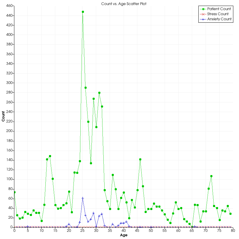
When I was first looking at the healthcare data, I struggled a lot with finding ways to visualize it. After all, a large portion of the data is categorical (Demographics, Injury Info, Encounter Info, etc.), so it was tough to work with in VTK.
After fiddling with the scatter plot in VTK for awhile (as seen in the assets folder), I thought it might be cool to look at patient ages and corresponding incidents. For instance, I asked myself the following questions:
- Does age influence incident reports (Anxiety, Vision, Stess, etc.)?
- How can we visualize that?
Using my experience with the scatter plot, I thought it might be interesting to then bin patients by age to see if I could find any trends in the data. Right away we can sew there’s a larger curve trending toward age 25 from both sides. I’m not sure why, but for whatever reason it seems this clinical data is skewed toward people in their 20s.
Of course, the assignment said this type of graph would be boring on its own, so I decided to take my analysis a step further. After scanning through the data set, the only other quantitative data set I could find were the incidents (aka diagnosis flags).
At that point, I figured it would be interesting to see if we could spot any trends between the incidents and the patient ages. As a result, I decided to bin a few of the incidents by count and plot them right over top of the age counts plot. To further emphasize the trends, I also decided to draw lines between each point.
Unfortunately, what I found was not all that interesting. As the number of patients per age bracket went up, so do the incidents. In fact, they appear to be almost directly proportional. No age had any frightening upticks in incidents.
Counts vs. Gender Bar Graph
The following visualization is a bar graph of patient counts vs. gender:
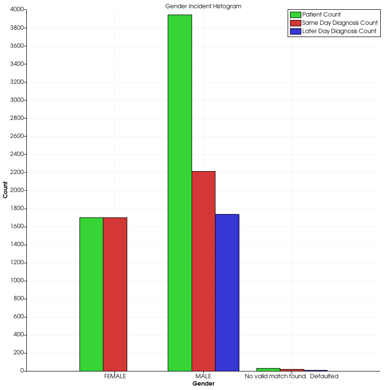
After looking at some trend data, I thought it would be cool to check out some ratio data. In particular, I was interested in looking at some of the disparity between men and women in the healthcare data.
Since I had already looked at incident data, I decided to analyze the injury code data which determines when patients came in for a diagnosis. Either they came in the same day of the injury (NSFINJ) or some time later (VCODE).
To generate this graph, I had to do quite a bit of data analysis which included filtering the data set by multiple columns (i.e. MALE & NSFINJ, MALE & VCODE, etc.). After completing all the calculations, I had to redesign the x-axis labels and provide a numerical for the data. Apparently, VTK can’t handle string data along the axes automatically.
As it turns out, women came in the same day at a 100% rate which is nearly unbelievable. Whereas, men turned up to the doctor just a bit over half of the time the same day. Otherwise, they went sometime later.
In addition, it’s clear in this case that men were overwhelmingly more likely to go to the doctor than women. Whether that means men get hurt and sick more often is left up to further analysis.
I find this style of graph–although simple–very eloquent as it clearly shows ratio information between men and women, men and men, and women and women.
Paraview
After using VTK, I felt it was only natural that I try to use the GUI extension, Paraview.
Frequency vs. Incidents Histogram
Up first, here’s a histogram of the EHR incidents and their frequency:
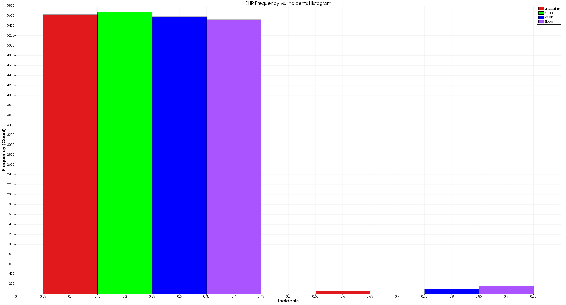
As I begin to play around with Paraview, I found out very quickly that it’s a bit rigid. In other words, I found it very difficult to replicate my original graphs, so I decided to make new ones.
To start, I figured it would be interesting to looks at some the incidents like Endocrine, Stress, Vision, and Sleep to see just how many patients came in for mTBI related issues.
To do this, I had to load the csv data into the tool and apply 4 separate histogram filters to generate this graph. From there, I customized the various colors, added labels, and changed the legend.
As you can see, there were very few patients that actually exhibited these four distinct incidents. Unfortunately, this visualization doesn’t capture the overlap, so there very well could be even fewer cases of mTBI.
That said, we’re able to clearly see which incidents accounted for the mTBI cases. For instance, sleep seemed to be a relatively common indicator of mTBI whereas stress didn’t occur once. Perhaps people don’t see the need to go to a doctor if they’re stressed.
At any rate, one of the things I don’t really like about this image is the x-axis. Along the bottom, you’ll notice that the scale is quantitative, but incidents either happen or they don’t (0 or 1). As a result, the graphics seems to indicate that some individuals had partial symptoms which doesn’t make a lot of sense.
That said, I struggled to find a better way to represent this data in paraview with the time allotted for the assignment. If there were more time, I would probably try to graph just the positive incidents (the values of 1). That way, we could better see the ratio between the various incidents.
Finally, I’d like to note that there doesn’t appear to be a way to address the legend size. As far as I can tell, there’s no setting for it. That said, I didn’t look very hard.
Frequency vs. Age Graph
For my final visualization, I decided to take a look at age again:
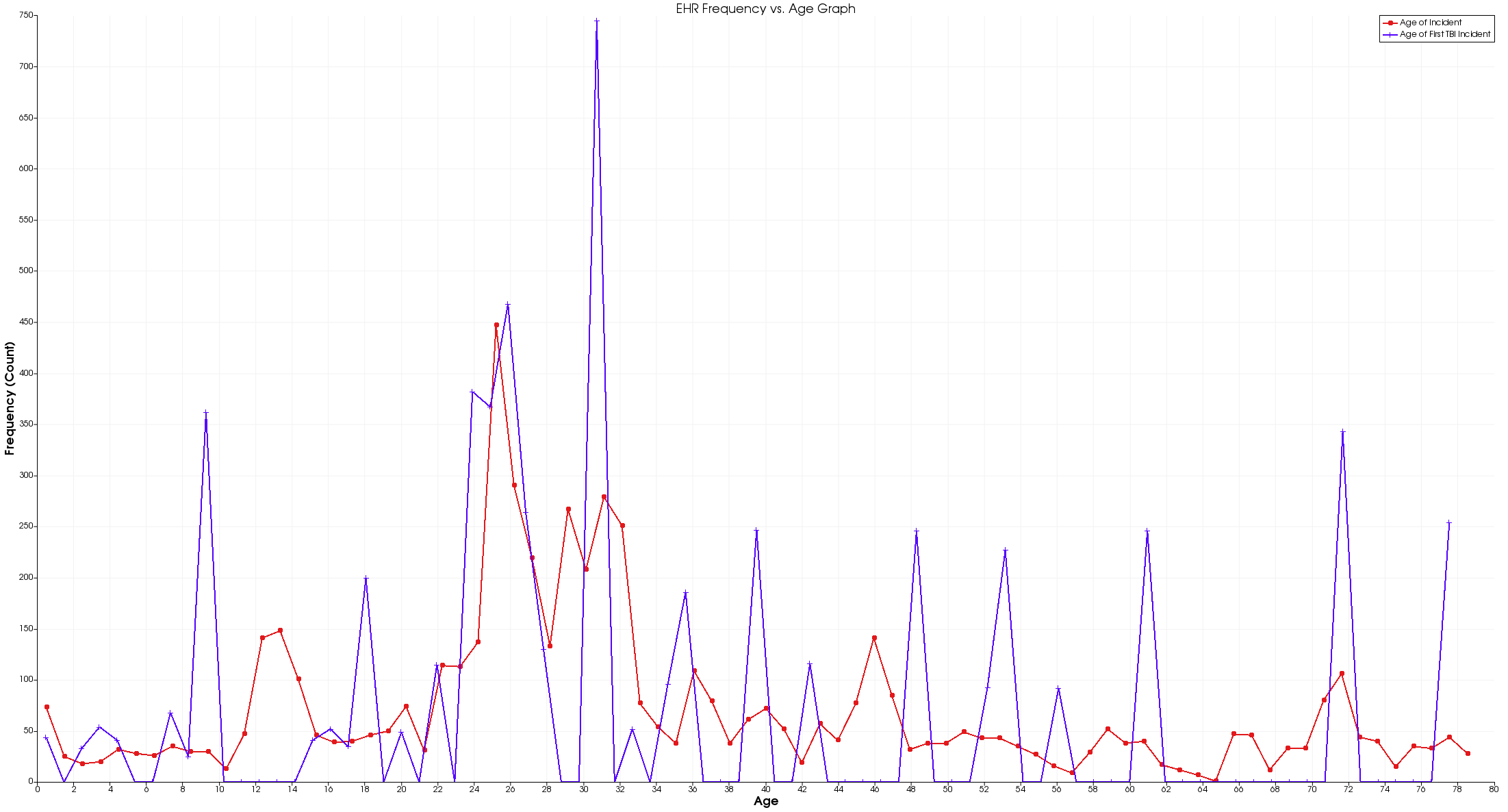
When I was looking for another visualization to create, I looked back to my first graph for inspiration. As it turns out, every row of data includes information about a patient’s first mTBI related incident. I thought it would be interesting to see if there was a relationship between patient age and when they first experienced mTBI symptoms.
To do this, I decided to use a histogram mapped to a line graph. That way we could see any age trends along the way. Then, I graphed the same histogram of age from before. However, this time I took a histogram of the age of the first incident, and plotted it over the age histogram.
Upon first glance, there’s not a lot to see except a handful of interesting peaks at 9, 25, 31, and 72. In addition, there are a handful of other spikes. Do these ages really indicate an increase in the potential for head trauma? I was a little concerned.
At that point, I realized that this visualization is actually very, very misleading. It would seem that folks who are 9, 25, 31, and 72 are significantly more likely to have a mTBI related event, but that isn’t true. Upon further inspection, I realized this graph has some flawed logic because patients can appear multiple times in the same data set. In other words, if a patient shows up more than once, they can skew the frequency of first mTBI incidents in their favor.
To fix this problem, we would need to filter the data by patient ID, but Paraview doesn’t appear to support that feature. So, I chose to leave the visualization for the sake of the discussion.
Again, there doesn’t appear to be a way to scale the legend. Feel free to let me know otherwise.
Favorite Image
Of the four visualizations above, my favorite visualization is:
I like this visualization because of how elegant it is. To the typical observer, it’s just a bar graph. But to me, it’s a clean and simple way of displaying several relationships between gendered data.
Just take a look at it. Within a few moments, you can make some pretty big conclusions about the data:
- All women went to the doctor the day they had their symptoms
- Roughly half of men went to the doctor on the first day of their symptoms
- There were over twice as many men at the doctor as women
Sure, we could have found all this information out by looking at some basic statistics, but this visualization gives us all that information for free.
Features
In this section, I’ll be covering the two best and one worst feature of the two tools I used: VTK and D3.
VTK
VTK, or the Visualization Toolkit, is a visualization platform that has API support in a handful of popular languages like Python, Java, and C++. In the following sections, I’ll cover the two best features and the worst feature.
One of my favorite features of VTK is the automation. In particular, I love that I can provide data to the library, and it automatically renders it with a legend, axes, labels, and points. All I have to control is the data, the type of chart, and the colors. Everything else is automated.
Also, I love how VTK graphs are interactive. While I’ve shared only screenshots, you can load up a graph and move it around. In addition, you can hover over bars or points and get their value displayed. It’s really handy if the data is dense, or you just want to check an exact value.
By far, the worst feature of VTK is installation. As a PC user, I had to go through an incredibly lengthy installation process just to start rendering visualizations.
According to the official documentation, installing VTK is a 7-step process:
- Download VTK
- Download CMake
- Create a Build Folder
- Run CMake
- Open the Visual Studio Project
- Install the Project
- Manual Building
In total, I spent about a day and a half getting all this together. After all, the CMake build and the Visual Studio build both take over an hour. And, if you’re like me, you don’t have Visual Studio or CMake, so downloading and installing those tools takes some time.
In addition, the directions include some implicit instructions on how to run CMake and Visual Studio, so I had to spend some time learning the ropes there as well.
After fighting with all that, I had to install Conda to install the Python VTK package. I’m not sure if there’s an easier way to do all this, but there are certainly no tutorials to help.
Fun Fact: In the time it took me to write this section, the Visual Studio build was only 25% complete.
Also, while not exactly a feature, the Python VTK documentation is slim. In order to learn the tool in a week, I had to do a lot of C++ to Python conversions which wasn’t ideal. There needs to be more plotting documentation in Python.
Paraview
Paraview is a GUI extension to the Visualization Toolkit which allows you to plot and manipulate data without the use of code.
After using VTK, Paraview pays off in its convenience. In particular, I like how easy it is to load csv data. In python, I was forced to manage all that data by hand. In Paraview, it’s as easy as opening a file.
In addition, once you have a graph decided, the settings are easy to manipulate. For example, it’s very easy to choose between the various colors for data as well as axes and legend labels.
On top of that, Paraview is excellent for drawing multiple plots and panes. In python, it can be difficult to stitch together view. In Paraview, not so much. It’s very easy and practical to look at a line graph and a histogram side-by-side.
By far, Paraview lacks intuitiveness. In an effort to replicate my first set of graphs from VTK, I could not figure out how to do any basic data analysis. After nesting a few plots, I figured out how to combine a histogram with a line plot, but it still didn’t give me enough flexibility to replicate my first graph. In many cases, I managed to crash the program as I attempted to run different tools on my data in hopes of getting the results I wanted.
After a few hours of toying around, I ultimately abandoned my attempt to replicate the original graphs before moving on. From there, I could only figure out how to generate a histogram and a line graph without and sort of categorical data. I still have no idea how to use categorical data in Paraview. To be fair, this is a similar complaint that I have with VTK, so the problem stems from there.