CSE5544
CSE 5544 Assignment 02
In this assignment, we were asked to review two visualizations: one effective and one ineffective. These visualizations must come from a written publication, so we can follow their design process. Examples papers can be found on the course paper list.
Each visualization must be evaluated based on the following criteria:
- How effective do you judge this visualization to be? Why?
- What are the most noticeable elements of the visualization? Are they the most important?
- Is there essential information missing?
- Are there elements which carry no information?
- Are colors used effectively?
- Does this visualization encourage any misperceptions?
- How could this visualization be improved? Offer specific suggestions.
In total, each review should be between a half and a full page of prose.
Research Discovery
As a bit of background, I chose to read up on some of the music research as it’s related to my final project and personal research interests. The following list of papers have been aggregated for my personal use:
- Analyzing Visual Mappings of Traditional and Alternative Music Notation
- An approach to leveraging multitrack information for artistic music visualization
- Visualizing Music in its Entirety Using Acoustic Features: Music Flowgram
- Simple: Assessing Music Similarity Using Subsequences Joins
- Improving Visualization of High-Dimensional Music Similarity Spaces
For this particular assignment, I chose to evaluate visualizations from the first and third papers.
The Effective Visualization
After reviewing a few papers, I decided that the most effective visualization was from the following paper:
Dasaem Jeong and Juhan Nam, “Visualizing Music in its Entirety using Acoustic Features: Music Flowgram”, in Proceedings of the International Conference on Technologies for Music Notation and Representation, 2016, pp. 25–32.
In particular, I took interest in the application of the music flowgram detailed in the paper:
With all that said, let’s take some time to review the literature.
Music Flowgram Background
In order to review this visualization, I think it’s important to discuss the goal of the research which was to create a music visualization that is less dense than sheet music for listeners. In other words, the researchers were interested in finding a way to simplify the music following task as score following is traditionally very difficult. In addition, the researchers noted that traditional music notation does not capture the global structure of a piece. Instead, it focuses on transient elements through measures.
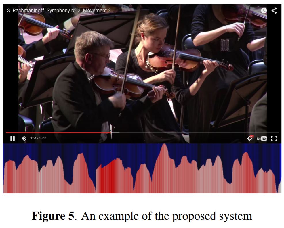
According to the researchers, there has been plenty of research to try to address the shortcomings in the music following task. However, manual mapping of music to score is an expensive process, and automated processes are still being researched. As a result, the researchers chose to circumvent music notation by introducing a new music visualization called the music flowgram which can be seen above.
To be clear, a music flowgram is not a new idea. Instead, it’s a concept borrowed from Freytag who visualized tension progress in storytelling. In this case, the idea is to demonstrate a change in music over time using a continuous two-dimensional graph. From this graph, listeners should be able to grasp the emotional aspects of music which are derived from loudness, tempo, and harmony.
Music Flowgram Review
At first glance, the music flowgram above appears to do exactly what the researchers intended. Without really knowing what the graph shows technically, we can see a bit of storytelling or trends in the graph. In this particular example, we can see the growth and decay of various portions of the song which likely imitate the ebb and flow of musical storytelling.
Upon further investigation, we’ll discover that volume is mapped to the y-axis. Meanwhile, onset density–which is related to tempo–is mapped to the graph color (red), and auditory roughness is mapped to the background color (blue).
That said, just how effective is this visualization? Personally, I think its excellent. As a musician, I find reading music to be challenging especially when you don’t have an understanding of the global structure of the piece. For instance, I may ask myself questions like:
- Where is this piece going?
- Am I conveying the right emotion? style?
- What was the composer thinking?
- What is my role in this piece?
To address these questions, a lot of band directors will try to emphasis the style or flow of a piece through their gestures. Unfortunately, this is often a slow iterative process as musicians slower find their role in the ensemble.
To me, this visualization does an excellent job of at least addressing questions of flow and emotion. In addition, it does great job of allowing listeners to follow along. And, I’m sure it helps a lot for recall and memorization.
Of course, there is the question of whether or not this graph needs data labels, and I’d have to say no. Here, the flowgram tries to illustrate storytelling, and adding data labels like loudness, auditory roughness, and onset density may detract from that goal. That said, more educated viewers may prefer the data labels.
In addition, it’s important to discuss how effectively the colors are used. First, I’ll say the choice of blue and red was excellent. One problem that often comes up is the use of green and red which isn’t great for color blind folks. That said, even after reading the paper, I have trouble telling which red corresponds to high onset density. I’m sure listening along would clear this issue up instantly.
Overall, I would say this is a very effective visualization. I think it does a great job of delivering essential information to the user without overloading them in details. Of course, people who want to know the technical details may find that this visualization is a bit lacking without labels. That said, music doesn’t exactly come with labels, so I think this is a fair visualization for musicians.
The Ineffective Visualization
As for the ineffective visualization, I didn’t have too look far:
Miller, Matthias, et al. “Analyzing Visual Mappings of Traditional and Alternative Music Notation.” arXiv preprint arXiv:1810.10814 (2018).
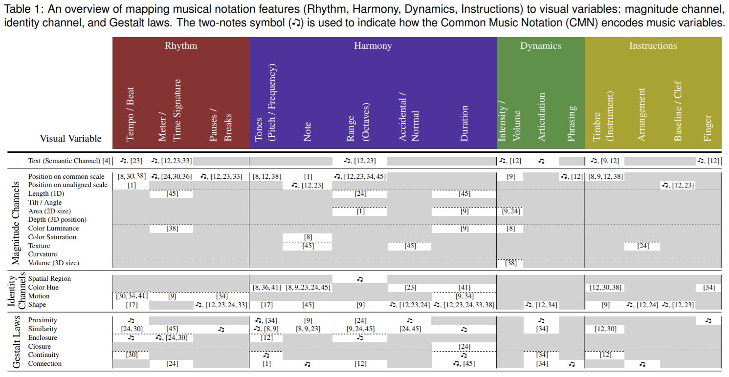
In particular, I noticed a rather dense table of information in the paper:
Before I dig into my review, I think it’s important to discuss the literature:
Background
According to the researchers, the motivation for this paper was to analyze musical notation as a means of communication. In other words, they chose to analyze several types of music notation to determine how we can rethink musical notation. Apparently, there’s very little research in this area. As a result, this research serves as a preliminary investigation of musical notation.
From my understanding, this paper looked into breaking down music notation into a handful of categories: rhythm, harmony, dynamics, and instructions. From these categories, the authors were able to specify criteria specific to the category. For example, rhythm is composed of tempo, meter, and pauses.
From there, the authors assessed each criteria on its ability to be visually encoded. For example, notes can be encoded on a common scale, through color saturation, or by texturing. Since this paper was a survey, each encoding is backed by proper research. All of this can be seen in the table above.
Review
When I first saw this visualization, I was very overwhelmed. After all, it contains 22 rows and 15 columns of data. In total, there are 330 cells of data. On top of that, the rows are sectioned into four groups, and the columns are sectioned into four groups. Based on those groupings, there appears to be about 16 classes of data.
Despite the size of the table, the data is actually quite manageable because the data is in a sparse matrix–meaning there aren’t actually 330 data cells. That said, when a cell contains data, the data is usually an array of numbers. In some cases, these arrays contain a special symbol (♫).
With all that said, by far my biggest complaint is the knowledge required to understand the visualization. Based on the description alone, I can’t gather what the values in the data cells correspond to, and the labels require a bit of background to understand. As someone with a music background, I would hope that the visualization would be able to distill what matters for the reader a little better.
On the plus side, I think the color usage is fine. I don’t see how color improves the visualization, but it doesn’t detract from it either. I also don’t think the visualization encourages any misperceptions. After all, all the data is there. It’s just not clear what the data is telling us.
After reading the paper, I would say the visualization makes a bit more sense, but there are definitely ways to improve it. For instance, the arrays of values should be labeled. To me, it was unclear what these numbers represented until I realized the cells were interactive. These values are actually citations. In other words, they represented proof that a particular criteria could be represented a certain way visually.
In addition, I would have liked to have seen some encoding examples. While I’m familiar with the common music notation in the west, I believe it would have been helpful to see a visualization of note texturing for example. Overall though, I think the visualization is useful. It’s just not that effective.