CSE5544
Assignment 03
Assignment 03 is a two part assignment based on event analysis.
Part One
During part one, we were asked to come up with some visualization methods for the EHR data set.
Group
In part one, we were asked to get into groups according to subsection 1. The following list contains all the group members.
- Jeremy Grifski
Tasks & Visualization
In part one, we were asked to come up with some interesting tasks to support in our visualization such as finding the time span of the most frequent encounter during the 2nd month. Then, we were asked to abstract that task, so it could be reused in other scenarios.
To address subsection 2, 3, and 5, we listed some data of interest, some associated tasks, some inspiration for visualization, and a sample visualization.
Data of interest
- PatientID
- Flags (PTSD, Depression, Audiology, etc.)
Tasks
- Count flag total per patient over time
- Line plot (flag count over time)
- Count lifetime flags per patient against total incidents (# of occurrences of PatientID)
- Scatterplot (lifetime flag totals vs. incident count)
- Interactive
- Both plots show an overview of everything
- Allow for patient selection which fades out both graphs
Inspiration
The following hockey scatterplot does a great job of illustrating what I would like to do for the lifetime flag totals vs. incident count graph. Each patient would have their own label on that graph which could be selected so all other patients would fade.
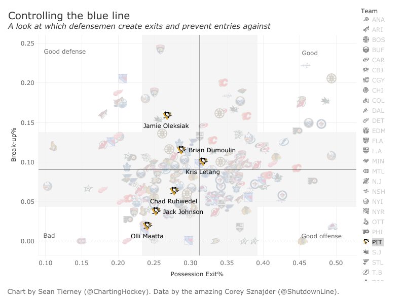
In this example, they do a bit of filtering by team, so it may be nice to filter by flag or something else.
As for the line plot, I drew some inspiration from the graphics from Google Search Console which allows you to select which lines to show:
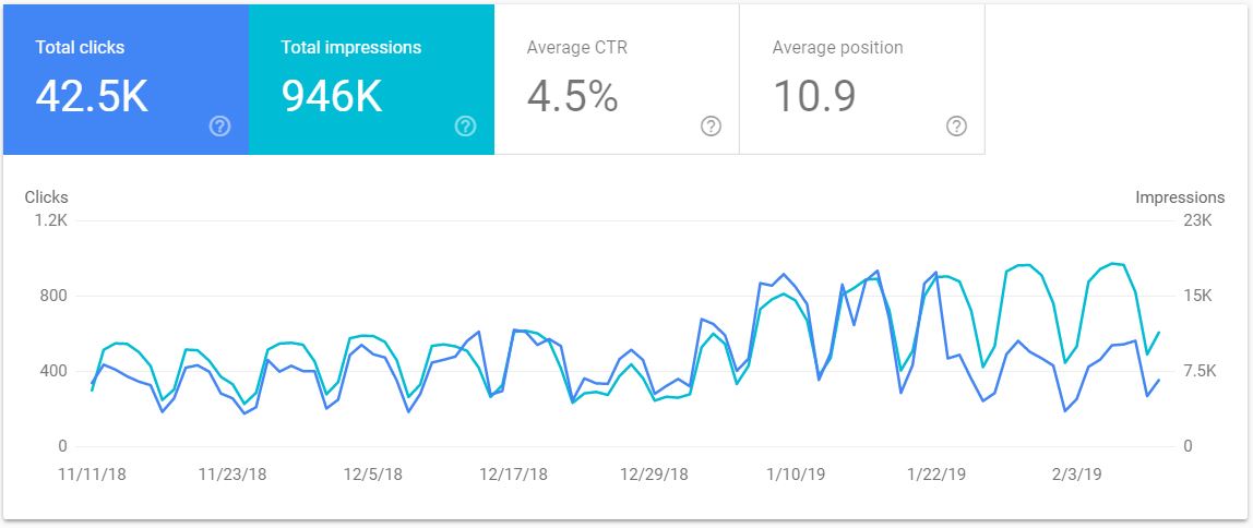
It’s not always clear how these graphs relate to each other, but you can clearly see how their trends are correlated.
Design
Based on the images above, I’d be interested in creating a dual interactive plot where the top plot is a scatter plot and the bottom plot is a line plot. Selecting a patient would allow you to bring that patient to the foreground in both plots. You could also potential filter patients by a specific attribute, so only those patients would be in the foreground of both graphs.
Specifically, the top plot would map every patient against their lifetime flag count (y-axis) and their incidents (samples). In this plot, I would expect to see some sort of linear trend where more samples means more lifetime incidents. Patients who don’t follow the trend may indicate outliers who need additional treatment.
Meanwhile, the bottom plot would be a line graph of every patient’s flag count over time (unsure about the units). In this plot, I would expect to see some sort of separation between mTBI patients and other patients.
Obviously, the challenge in the second graph is labeling. We wouldn’t want to use color to separate the lines as there could be thousands of patients. In addition, the x-axis isn’t exactly simple. Not all patients share the same time line or have the same number of samples, so mapping could be an issue. For those reasons, it may make sense to leave out the line plot and focus on the patient mapping.
At any rate, here’s a sample look at the double plot solution:
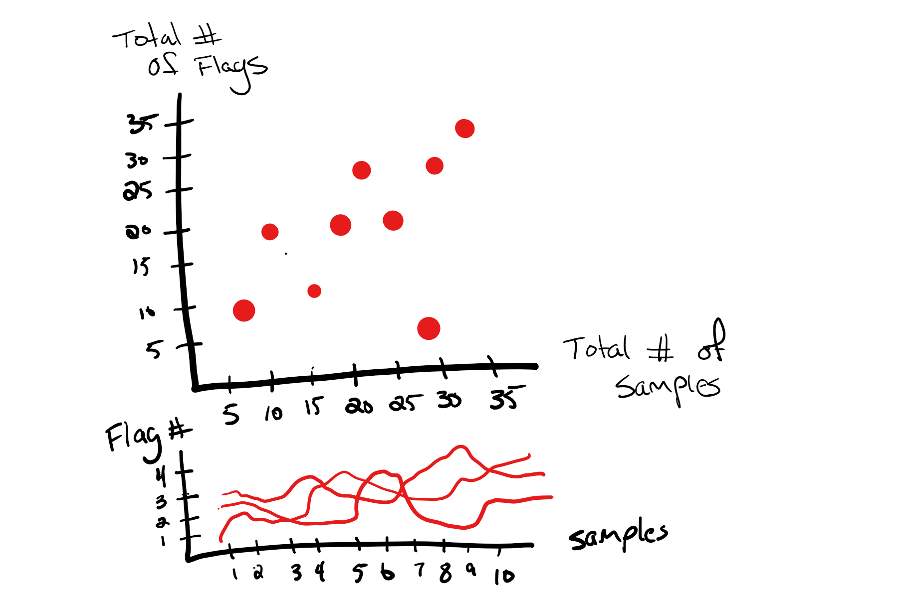
Look to the explanation above for details.
Design Analysis
As a part of subsection 4, we were asked to participate in the voting of other designs. In addition, we were asked to critically analyze our own design using the following criteria:
- how does the design address event-relevant tasks?
- how many items can the design show on a 24-inch monitor?
- does it use overview+detail technique?
- does it show “temporal” changes?
- whether or not it introduces clutter by comparing with all other designs
- is the design visually pleasing?
Let’s take a look at the responses.
How does the design address event-relevant tasks?
Personally, I think this visualization does a good job of addressing event-relevant tasks. In particular, it’s focused on aggregating individual patient samples and draws relationships between patients who may have had more or less events.
How many items can the design show on a 24-inch monitor?
Based on hockey chart, I’d have to imagine at least 20 * 31 items which is the number of hockey players per team times the number of teams. That gives us a rough idea of how many data points are in the sample hockey image. In other words, we could probably map rough 600 or so patients to the graph.
The line graph is far less scalable. I’d hate to draw 600 lines because there would be no real way to distinguish between them before filtering.
Does it use overview+detail technique?
Absolutely! At first, all patients can be seen, but we can quickly filter by patient or any arbitrary criteria to start looking at subsets of patients.
Does it show “temporal” changes?
In the patient scatter plot, there’s not much in terms of temporal change. We’re really just looking at totals. That’s why the line plot of flags over time was also included, but it seems to be more of a hindrance than a help.
Whether or not it introduces clutter by comparing with all other designs
I’m not sure how to interpret this question. To me, the visualization seems pretty clean. The overview can feel pretty cluttered, but it gives a nice overview of where the outliers are.
Is the design visually pleasing?
Based on the hockey example, yes! I’m not sure how to make this one just as visually appealing without assigning glyphs to patients by category (gender, age, etc.) or using individual photos. In either case, I’m pleased with the design.
Part Two
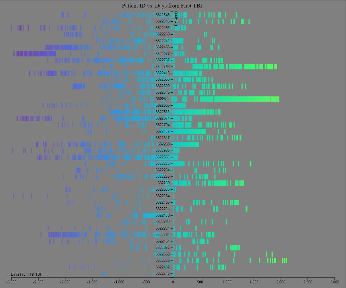
In part two, we were asked to implement a visualization based on the group voting process. You can find my visualization below or live here:
In addition to the visualization, we were asked to perform a critical analysis of the visualization using the following questions:
- How have the encounters reduced between the first and the second three months?
- How have the frequency of encounters (hospital visits) changed from the first to the second three months?
In addition, we were asked to cover three pros and cons of this visualization.
In the following sections, I’ll attempt to address these questions.
Reduction of Encounters
Perhaps I didn’t follow directions correctly, but it seems difficult to tell how the encounters reduced over the months. Since the patient graphs are organized by days from encounter, it’s tough to make any sort of conclusion regarding encounters on a monthly basis.
That said, we can look at the first 180 days of each patient following the TBI and see if there are any sort of trends from the first to second half. It appears that about half the patients stopped coming back after their TBI while the remaining half consistently came back.
It would be interesting to sort the patients by encounter totals to see which patients frequently visited the doctors and how the timing of the visits affects the overall frequency of encounters.
Frequency of Encounters
To be honest, I’m not sure how this question is different from the previous one. If the previous question asks about reduction of encounters, I suppose this one broadens the discussion.
In that case, it appears encounters are densely packed after a TBI and reduce in frequency over time. In some cases, the encounters drop off completely before resurfacing with the same frequency.
Beyond that, it’s tough to gather any sort of month-by-month data with this visualization. That said, I think this is a great visualization for individual patient trends. We can clearly see how a TBI affects the encounter rate of individual patients.
Pros and Cons
As I’ve begun to discuss a bit in the previous sections, there are some advantages and disadvantages to this visualizations.
Pros
- Individual patient trends over time are really easy to see
- Relationships between before TBI and after are very clear
- Frequencies of events are easy to see
Cons
- Relative patient trends over time are not easy to see
- Patient information like gender, age, and flags is nonexistent
- Implementing all features would start to introduce confusion and chartjunk
Extra Credit
I’m not sure if I addressed anything in the extra credit, so I’ll take some time to briefly explain my solution.
As you can see in the static image, every encounter per patient is denoted by a 5 pixel wide bar colored using the cool sequential color scale. Earlier encounters are in purple and later encounters are in green.
In addition, all bars are interactive in the sense that they change color on mouse over. In addition, the data of that data point is displayed as a tooltip. This way some of the relative temporal information is captured. After all, two bars can have the same x-value and still have different dates.
Finally, bars to the left of the first encounter line have 50% opacity. Meanwhile, bars to the right of the first encounter line have 100% opacity.
Beyond that, there is no additional encoding.