CSE5544
Assignment 04
In assignment 4, we were asked to directly visualize a 2D vector field from a given data file. Naturally, I used D3. In the following sections, I’ll explain my findings.
Direct visualization
To visualize the vector field, I used several data filtering methods. For the sake of completeness, I’ll share all of the figures I generated below.
Before that, I’d like to take a moment to explain the design. In order to use the provided data file, I did a bit of data preprocessing in Python. In particular, I removed the first line, parsed all the remaining lines, and output them to a csv:
with open("E:\\Projects\\CSE5544\\assignment04\\data\\testGHZ400.data") as f:
    with open("E:\\Projects\\CSE5544\\assignment04\\data\\testGHZ400clean.data", "w") as out:
        for line in f:
            print(",".join(line.split()), file=out)
At that point, I loaded the csv into D3, converted the new array into a 2D matrix, and iterated over each data point for plotting purposes. Sampling was accomplished by tracking the current row and column and running a simple modular expression of those indices:
if (i % 2 == 0 && j % 2 == 0)
In this case, I sampled every other row and column. The values above can be changed to allow for any sampling approach.
To get the appropriate vector length, I uniformly scaled down each vector by an arbitrary value (1/40). This appeared to be the best choice for the visualization. During experimentation, I changed this value.
Also, I should note that I didn’t use traditional arrows for encoding. Instead, at the tip of each vector, I placed a circle.
The following graphs demonstrate the results.
Figure 1
The following visualization demonstrates 1 x 1 sampling for a total of 160,000 vectors.
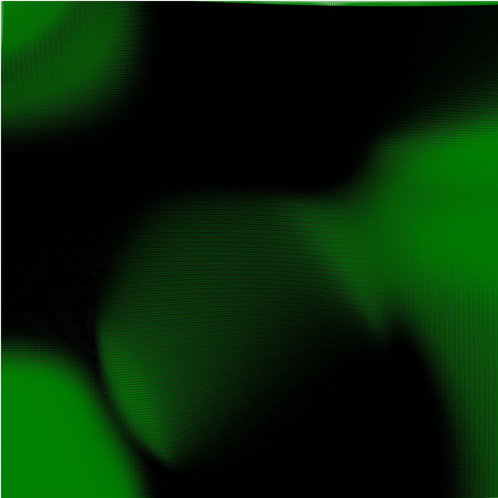
Due to the density of the vectors, it’s very difficult to see any sort of pattern here. In fact, we can’t even see the axes. On top of that, it takes some time to render and 16,000 data points.
Figure 2
The following visualization demonstrates 2 x 2 sampling for a total of 40,000 vectors.
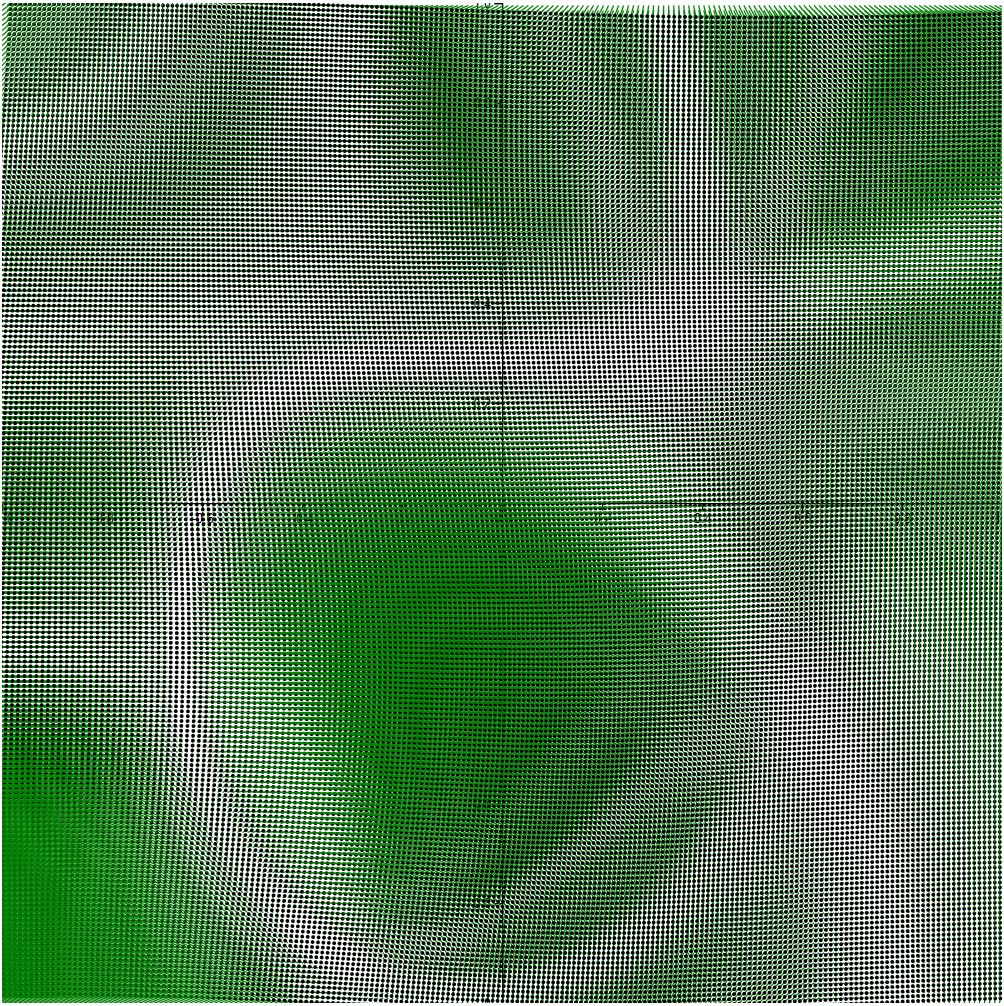
Reducing the vector count to a fourth introduces what looks like aliasing defects in the visualization. That said, at the very least the axes are visible, and rendering time is decent.
Figure 3
The following visualization demonstrates 5 x 5 sampling for a total of 6,400 vectors.
At this point, the vector field is a lot more manageable. It’s easy to see where there is flow and where there isn’t. Unfortunately, it’s still difficult to actually see the direction of the flow.
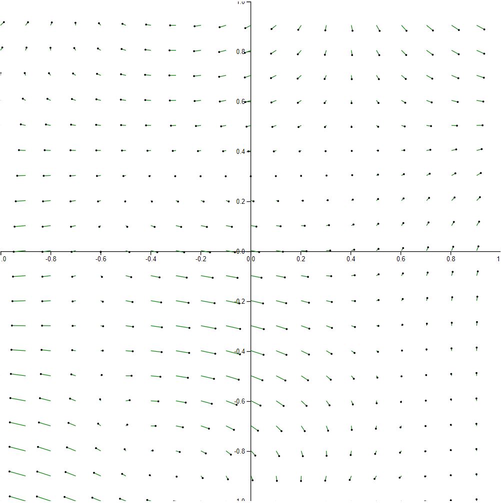
Figure 4
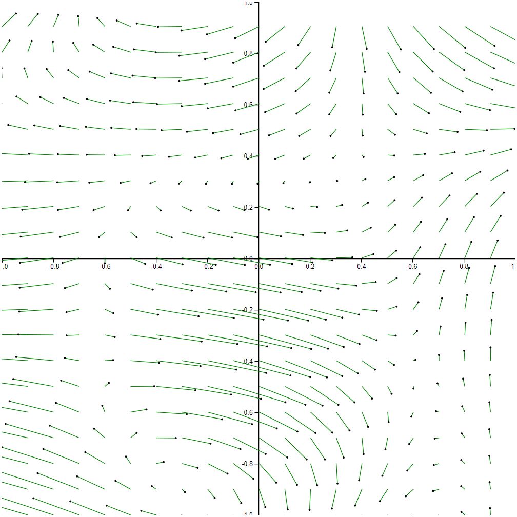
The following visualization demonstrates 10 x 10 sampling for a total of 1,600 vectors.
At this point, the added whitespace allows us to really appreciate the flow. For example, there’s a clear downward flow occurring in the top of the upper right quadrant.
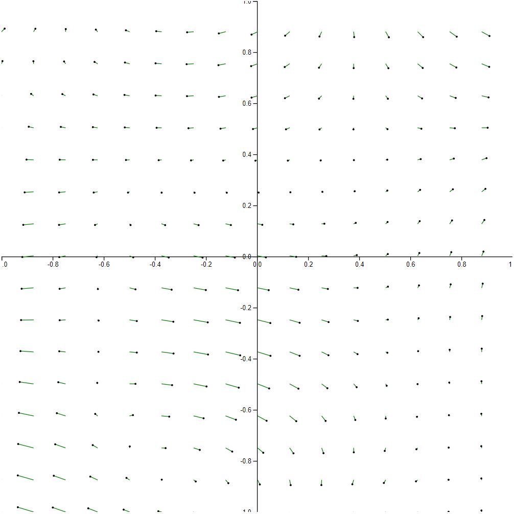
Figure 5
The following visualization demonstrates 20 x 20 sampling for a total of 400 vectors.
At this point, we start to cross over into undersampling territory. At a high level, we can still see some of the major trends in the vector field, but we start to lose some of the finer details. Sampling less than this would like result in the appearance of completely new trends.
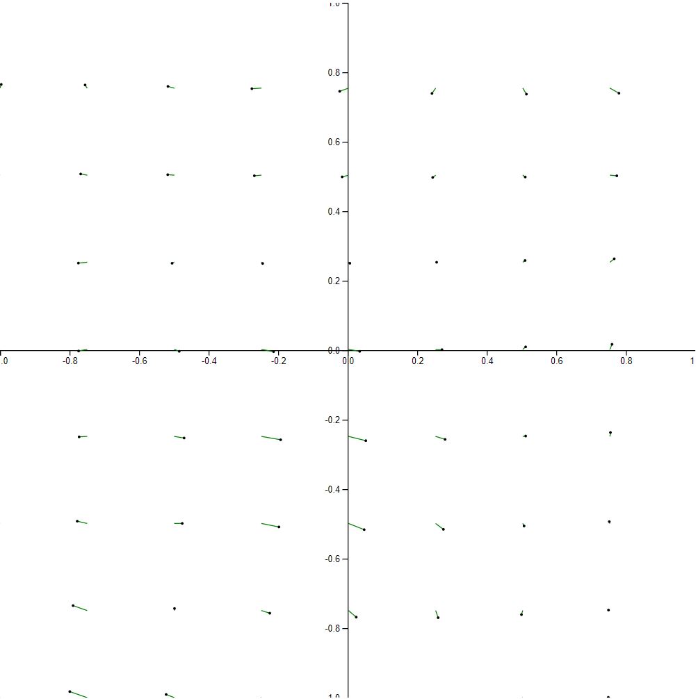
Figure 6
The following visualization demonstrates 25 x 25 sampling for a total of 256 vectors.
With only 256 vectors, we start to see serious sampling artifacts. For instance, the smoothness between vectors is almost completely gone. It’s not unusual to spot two adjacent vectors with wildly different lengths. In addition, some areas that used to have flow suddenly appear as dead zones.
Figure 7
The following visualization demonstrates 50 x 50 sampling for a total of 64 vectors.
Finally, we end of with a vector field that looks sort of like a set of clocks from around the world in no particular order. Some dominant trends can still be spotted, but overall flow is structure is completely lost.
Figure 8
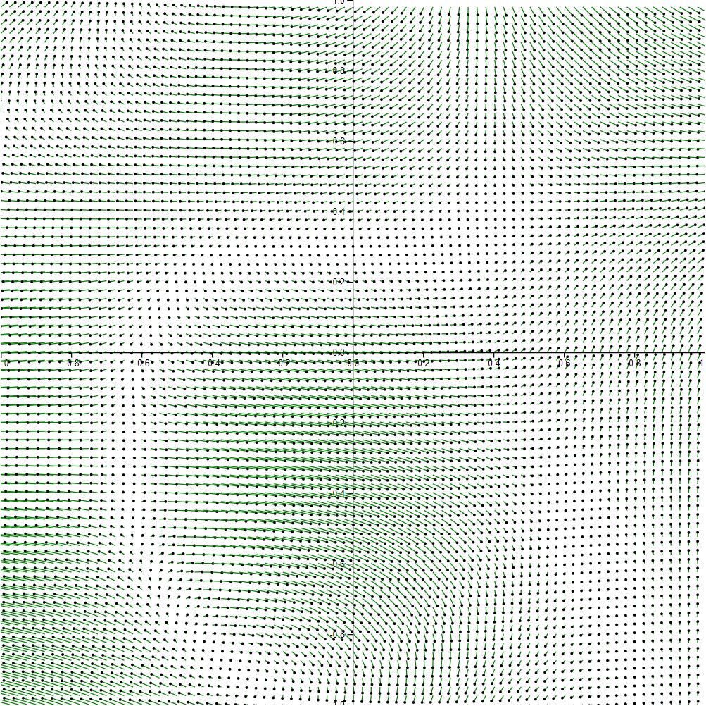
At this point, I return the sampling rate to 20 x 20 and begin fluctuating the scale. The following visualization demonstrates 20 x 20 sampling and no scaling.
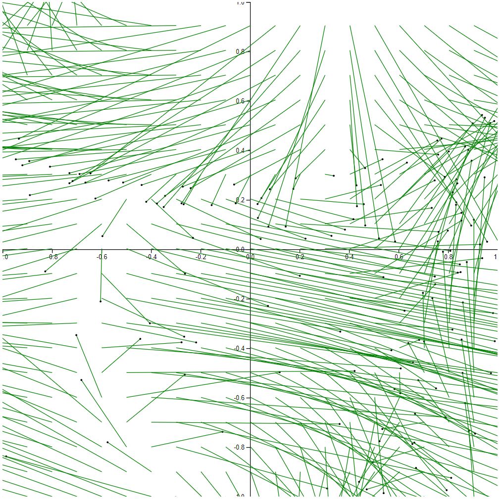
With so many overlapping vectors and vectors leaving the graph, it’s tough to tell what’s happening. That said, the dominant flow directions are very clear. It’s just tough to see where some vectors begin and others end.
Figure 9
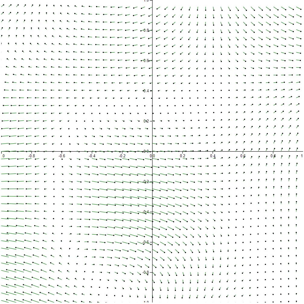
The following visualization demonstrates 20 x 20 sampling and 1/10 scaling.
In general, I like the scaling here because it does a great job of illustrating the flow. Clearly, there’s a strong spiral forming in the bottom right and top left corners of the graph. Also, some the areas that lack flow area even less noticeable now. Of course, the overlapping vectors are not ideal.
Figure 10
The following visualization demonstrates 20 x 20 sampling and 1/100 scaling.
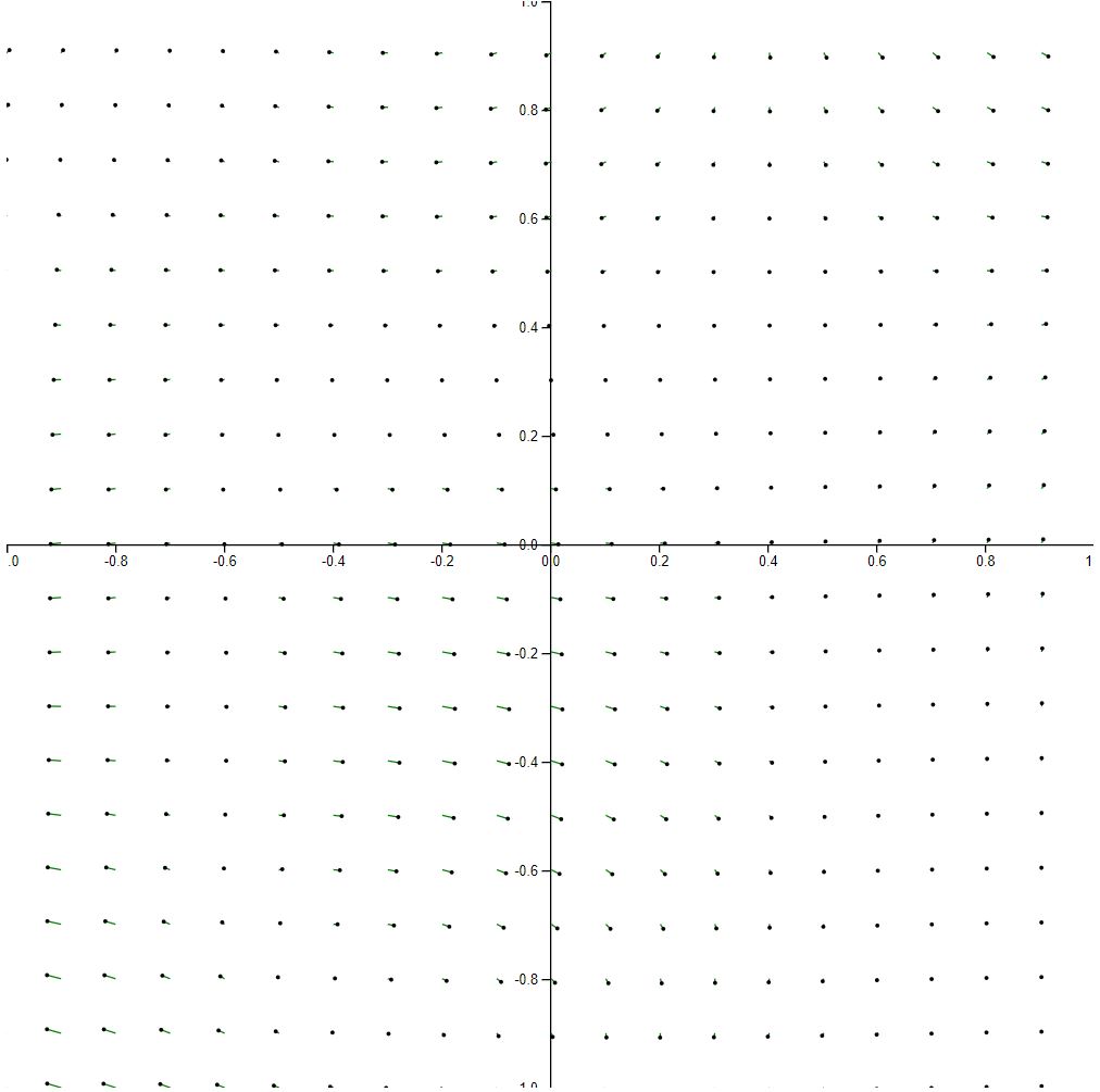
Finally, we go to the opposite extreme of scaling down too much. In this figure, it’s almost impossible to see any vector activity at all. That said, it does a nice job of capturing the strongest vectors as they’re the only green bits in the entire visualization.
Experimentation and Report
Following the direct visualization, we were asked to perform a bit of experimentation. As you can see in the previous section, I’ve already done a bit of that. In addition, I’ve already taken some time to briefly explain my findings. That said, there were two questions we were asked to specifically address, so I’ve shared those answers in the following subsections.
What interesting features did you discover?
As mentioned previously, I think the most interesting features of the data set have to be the following:
- The downward flow that appears to influence most of the graph in the top of the upper right quadrant
- The dense flow situated near the lower central part of the field
- The lack of flow in areas surround the previously mentioned dense area
All three features were fun to observe as I tampered with the sampling and vector lengths.
How do they compare for showing the features.
In general, I’ve found that you can definitely oversample as well as undersample.
Oversampling results in a plot that shows no meaningful data since you can’t discern any visual markings (see Figure 1). Even if you can see the visual markings, the result is still deceiving as you get a bit of an aliasing effect. In other words, the visual markings are so close together that you get a sort of pattern that shows up which doesn’t map to the data at all.
Oddly enough, oversampling seemed to do a great job of share both the dense and stagnant flow areas. However, it does a very poor job of showing the downward flow trend.
Undersampling results in a plot that also shows no meaningful data since so much information is missing. As a result, you can easily start to imagine patterns that aren’t there (see Figure 6).
In general, undersampling didn’t really hurt my ability to track strong flow regions like the downward flow area or the dense flow area. However, it’s not great for observing the narrow stagnant areas.
Meanwhile, vector lengths are a powerful tool for recognizing flow trends. For example, you can extend the length of vectors to try to see trends in very small vectors (see Figure 9). Areas of the field that may have looked stagnant before can suddenly become expressive.
Of course, there’s a dark side to increasing vector lengths. If you’re not careful, the vectors can overlap each other, and you’ll start losing clarity in the field (see Figure 8).
Overall, I’ve found that varying the length of the vectors really didn’t hurt my ability to see any of the three features except maybe the downward trend. After all, the longer the vectors the more information that’s lost due to crowding.