CSE5544
Midterm Exam
To submit, please drop your answers to your Github repository in a sub-folder named “Midterm exam”. Please submit by 11pm on Tuesday 26. This part must be your own. Please set a clock and finish in 40 minutes.
Problem 01 (40 Points)
Now almost all news media become an avid consumer of visualization. As a matter of fact, the use of visualization is pervasive in the media to support an argument or specific viewpoints. The authors of the visualization often emphasize one specific point and down play the others. Doing so could lead to either informative or misleading design and the results can vary widely. For this question, pick out two examples, one good and one bad visualization, from any of the following sources:
Please use a very interesting one here https://www.nytimes.com/2014/04/23/upshot/the-american-middle-class-is-no-longer-the-worlds-richest.html And choose one and only one from the Washington post. https://www.washingtonpost.com/graphics/2017/ns/year-in-graphics/?noredirect=on&utm_term=.2af846d20dbf
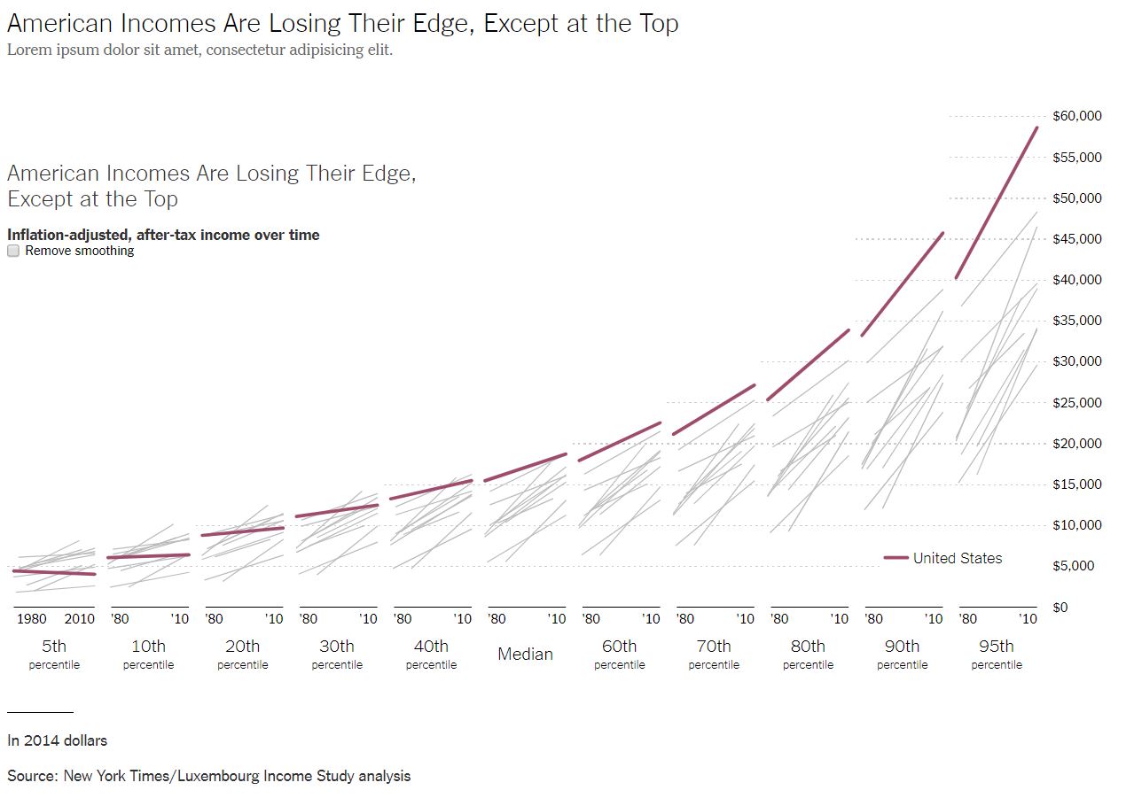
For this problem, I chose the following graph from the New York Times as the good visualization:
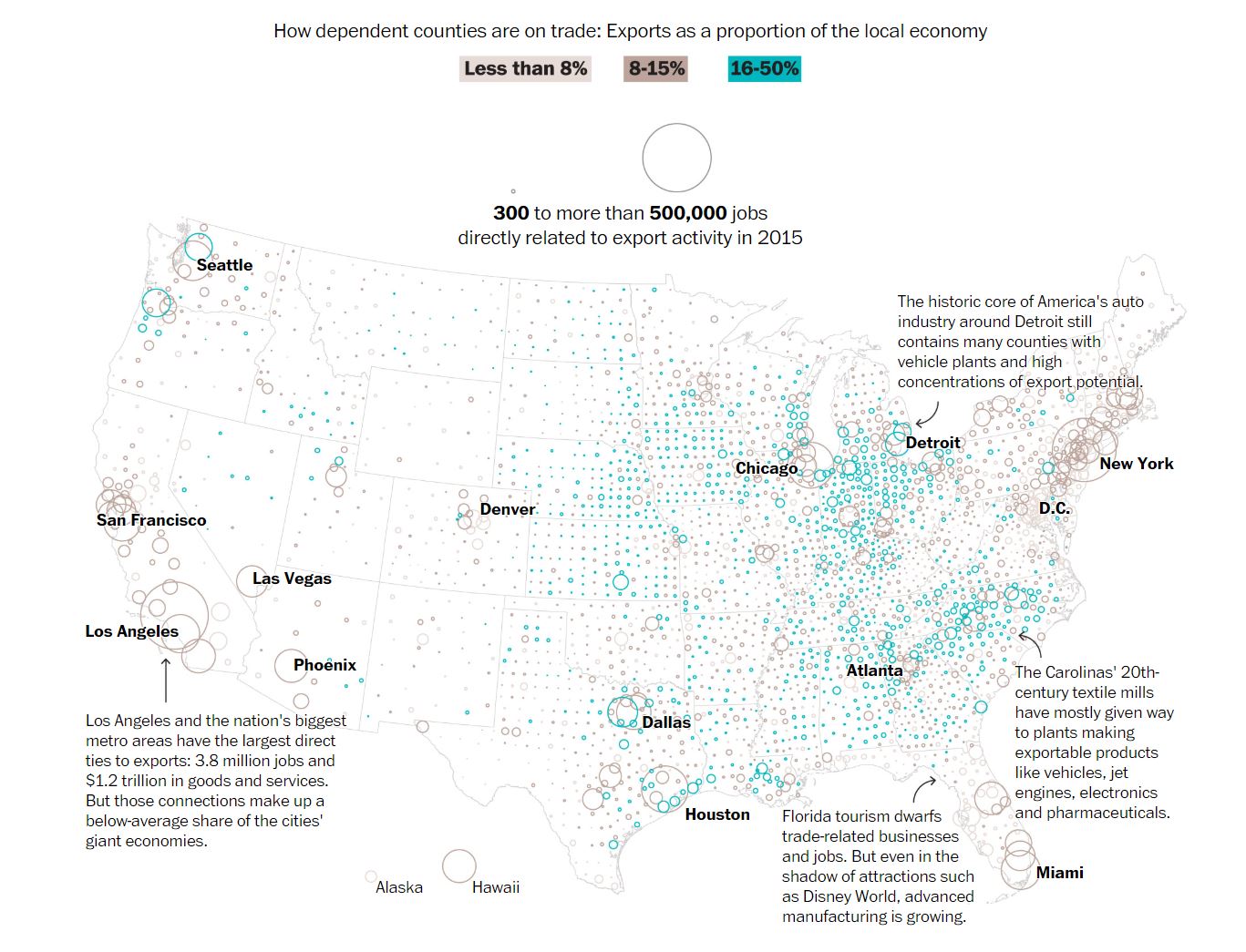
Meanwhile, I chose the following graph from the Washington Post as the bas visualization:
In the following subsections, I’ll break down each visualization.
Part 01 (10 Points)
Provide 2-3 tasks or arguments the visualization(s) attempt to convey.
The good New York Times visualization tries to argue the following:
- The rich in the US have gotten richer from 1980-2010
- The poor in the US have stayed poor or gotten poorer from 1990-2010
- The US middle class is no longer the richest
The bad Washington Post visualization tries to argue the following:
- Certain counties in America are at more risk from a trade war than others
- Certain counties rely more on exports than others
Part 02 (10 Points)
List the visual mapping method (data to visual marks) the news medial used to support its argument about the data.
At a high level, the good New York Times visualization leverages a 2D matrix where the x-axis consists of bins of income percentiles and the y-axis consists of per capita incomes. Each bin features a set of line graphs from 1980 to 2010. Each line in each graph corresponds to a country where the country of interest, the United States, is given in a purple color. Everything else in the foreground (the axes, other line plots, labels, etc.) are black while background elements like dotted lines for reference are a light gray.
In addition, the graph features two elements of interactivity. When you hover over a line in one of the bins, it highlights that line in all the bins and provides the country’s name. Likewise, there’s a button to remove smoothing which makes each line plot a bit more jagged.
All of these elements come together to really highlight the US while showing the country in context. Based on their tasks, I’d say they did a great job.
Overall, the Washington Post visualization is quite simple. It’s a map of the United States, and every county has a circle over it that varies in area and color. The color signifies the proportion of exports where light brown is < 8%, slightly darker brown is 8-15%, and blue is 16-50%. Meanwhile, size of the circle corresponds to the number of jobs that depend on export activity. Between the choice of color scale and the choice of circular area, I don’t know what’s worse for conveying their argument.
Part 03 (10 Points)
Cite a reasonable design and explain why in terms of addressing the task, effectiveness of the visual encoding, by discussing the pros and cons (if any).
In the good New York Times visualization, I’m a huge fan of the per capita income axis on the right rather than the left. Since the time data trends toward the right, it makes sense to have the y-axis on the right for easier viewing. To further aid in clear reading, they’ve provided light background lines to show where important milestones are on the scale.
Probably the best design choice in the Washington Post visualization was the use of blue to signify areas of export ratio. In general, the visualization lacks colors, so the use of blue is excellent for making certain counties stand out. Of course, the scale then makes almost no sense because it moves from brown to blue, and the binning of colors on the scale seems completely arbitrary.
Part 04 (10 Points)
Cite a bad design and explain why in terms of task, visual encoding, encoding effectiveness based on criteria learned in class. Specifically, how will you fix the problem(s)?
In the good New York Times visualization, there’s an odd subtitle on the graph which reads: “Lorem ipsum dolor sit amet, consectetur adipisicing elit.” Apparently, they hadn’t noticed that the subtitle was filled with generic text. To make matters worse, the title actually appears twice. This can be remedied be removing the duplicate title entirely.
If I had to choose the worst design of Washington Post visualization, I’d have to say the circular area encoding. While they do stick out on the graph due to their size, it’s almost impossible to tell which county they represent. In many cases, the largest circles contain circles for adjacent counties. Gather enough circles and it becomes hard to tell where in the country we’re focusing on.
They try to adjust for this problem by labeling the counties with the largest circles, but this introduces an incredible amount of chart junk that makes it hard to focus on the graph in the first place.
Fixing the problem is a challenge of its own, but I would probably choose a different encoding method. Instead of area, why not use a different glyph? If the data is continuous, it may make more sense to swap the encoding. They used color for their binned values, but it might make more sense to use different shapes instead. Then, they could use a nice color scale to indicate number of jobs.
Problem 02 (40 Points)
In case you don’t know, Google now provides a Dataset Search Engine here: https://toolbox.google.com/datasetsearch. Now you are wearing the designer head. I found some interesting datasets and this data about official development assistance is interesting to visualize and the data are available online at http://data.un.org/DocumentData.aspx?id=163. Your task is to design a static (i.e., single image) visualization (5 points for the design sketch) that you believe effectively communicates the data and provide a short write-up (in 4 paragraphs) describing your design (15 points) and questions (10 points) that can be answered through your design). In short, you are trying to be a visualization designer as in New York Times or Washington post. What story (or stories) are you trying to tell? Just as important, also note which aspects of the data might be obscured or down-played due to your visualization design.
In your write-up, you should provide a rigorous rationale for your design decisions for choosing techniques, for example for an overview first, zoom and filter, then details-on-demand or one of these. Document the visual encodings you used and why they are appropriate for the data. These decisions include the choice of visualization type, size, color, scale, and other visual elements, as well as the use of sorting or other data pre-processing. How do these decisions facilitate effective communications? (10 points)
Your grade will be based on the effectiveness of encoding. It is okay to plot your graphs using a familiar software, “glue” your visualization on paper, and submit a screenshot here. Implementation is not required.
Based on the data, I chose to come up with the following visualization:
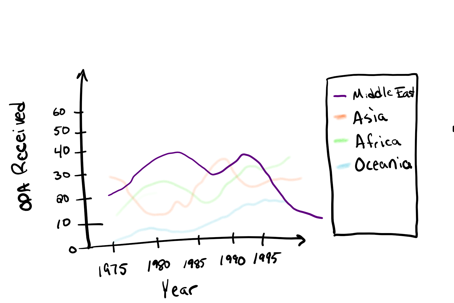
In this visualization, I chose to answer the question: “what effect has region had on ODA received over time?” Or more specifically, “how has aid to the middle east compared with other regions over time?”
Given that the table provided is just time-series data on a per country basis, I thought it would be interesting to bin countries by their region and combine their overall ODA received per year.
Regions could be broken down into the following categories according to Science Trends:
- Africa
- Asia
- Central America
- Eastern Europe
- European Union
- Middle East
- North America
- Oceania
- South America
- The Caribbean
Since I only have 10 regions (categories), I have a lot of options in terms of encoding. However, since I’m trying to show time series data, I have to be careful how I order my data.
Overall, I chose a simple line plot where the x-axis would feature the years, and the y-axis would feature the ODA received. As for the plot itself, I borrowed some of the techniques from the New York Times visualization. In particular, the middle east would be the a solid colored line on the graph while the rest of the lines would be transparently colored. This takes advantage of the focus+context mantra which allows us to see what we need to see in context.
As always, I’d feature an easy to read legend on the side of the graph, so readers could tell what each line signified. In addition, I would give the graph a clearly readable title such as How Aid Has Changed in the Middle East Over Time.
In general, I’m convinced this design will clearly communicate what is intended as line charts tend to be good at showing data trends in an easy-to-digest format.